
I have been putting in some work on the Royfuss Games website. I have been updating some cover art, making some adjustments to the layout, and overhauling a lot of code. I am loving the backend stuff, but I am not sure if I 100% like the look. It does allow me to do more, so I am going to stick with it for awhile.
I am very happy with the new cover art. I wanted every game to be identifiable by its cover art. I had lot of ones where I hastily cropped and resized them, and you could not make out the title of the game. Also, several of the covers just looked bad. I found cleaner artwork, and cropped and resized hundreds covers.
With a tedious, but simple task, complete, I decided to tackle larger issues. I wanted to condense my navigation and make the website mobile friendly. I downloaded Pico CSS, and experimented with the framework. I jammed my design onto its bones, and it did not go well.
I spent a lot of time making changes, and testing it on desktop. When I got things looking good, I resized the window to see how it would look on mobile. I had a few gripes, but it was functional. I uploaded it and opened it up on my phone… it was a dumpster fire. When I tested it on desktop, I would always load a page, and then resize the window. This worked like a charm. Loading the page in a smaller window, like on a phone, yielded horrible results. I scrapped it, and went back to my old design.
I still wanted a more condensed navigation, and at least lay the groundwork for a future mobile friendly version of the site. I learned some things from Pico. I started with the navigation. I got rid of the dedicated “Home” button, and changed the banner to be a link to the home page. Instead of the big and blocky sub-navigation for the data and search pages, I moved those links to a drop down menu. It has an added benefit of being able to get to those sub-pages from any page. After making those changes, I suddenly had a lot more space.
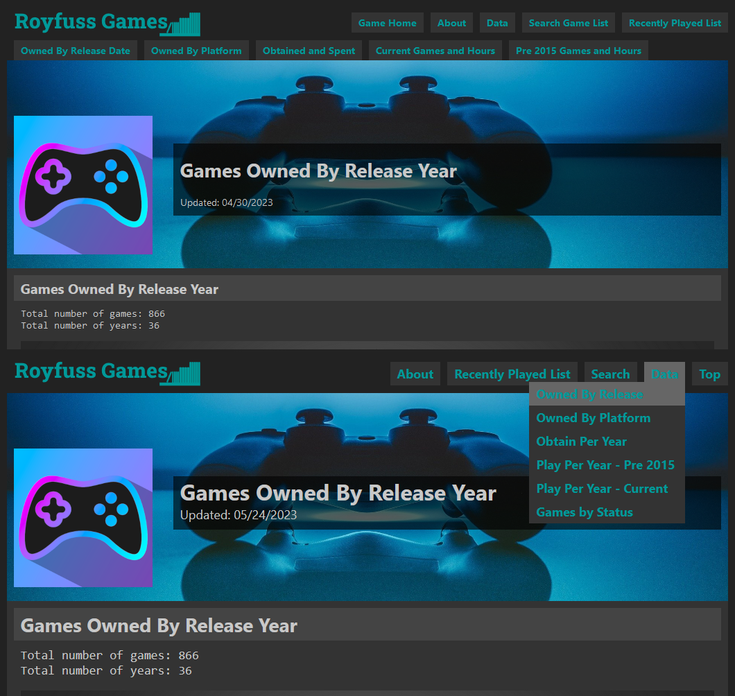
Next up, the text needed some updating. I updated to a modern fontset, and the font sizes are more mobile friendly. I think it looks big on desktop, but it still looks small on mobile. The backend code makes it easier to address a possible mobile layout in the future. I purposely made lists of games on the data and search pages bigger, so it is easier to click on mobile. Again, it is still too small.
To fully commit to a mobile friendly layout, I need to do some major overhauling to my horizontal space. A thing like limiting tables to two columns will go a long way, but require major changes to my Python scripts. The screenshots on the game badges are currently 1040×300 pixels, and they were cropped for the full layout; I would have to change those to look good at dynamic resolutions. I am just not ready to jump into all of those changes.
With my navigation layout updated, I decided to actually add some new content. I added a new Games by Status data page. It breaks down the status of a game by “playing,” “completed,” “incomplete,” “resting,” or “backlog.” I have been curious (and a little scared) to see what my actually backlog looks like. This puts it with a nice perspective. I would like to breakout the “backlog” category to “want to play” and “no intention of playing,” but that will require a redesign to the database. Still, the page has some good information.
I added a whole new section: top games. Right now I have four sub-pages. Each page contains a dataset of games, and ranks them. It displays the top 10 with the game badge, and then displays the full ranked list below it. The top games by value page is interesting. I do not like ranking games by “cost per hour.” I would gladly pay $50.00 for a two hour game if it is outstanding. It is a little weird to see the values spelled out like that. Obviously, I could not calculate free games, or any game that I did not know how much I spent on it. It is still a good dataset with over 250 games. I should limit it to completed games, or games where played for more than an hour. Seeing Shadow Warrior 2 ranked with $150 per hour is ridiculous.
The four pages I have now are all data driven, so those are easily generated using my Python scripts. I would like to create some top pages that are more curated. It would be fun to have my personal ranking of all the games on each console. A couple things are holding me back. One, my rankings change all the time; one day I will say “Super Mario World is the best game on the Super Nintendo,” and the next minute I will say, “Kablooey is the best.” Well, maybe not, but you get the picture. Two, I do not have a lot of games to compare on the consoles. Castlevania: Aria of Sorrow is the only Game Boy Advance game I have played. Good job, Aria of Sorrow; you’re the best. Thirdly, I have played a lot of games on PC from several decades. How do I compare Starcraft with Psychonauts 2? I consider both games outstanding PC games, but they do not seem to fit onto the same list. Lastly, some PC games deserve to go on other lists. I would consider Chrono Trigger a Super Nintendo game, even though I played it on PC.
I have been chipping away at the problem of ranking video games. If I like the outcome, I’ll add it to the site. For now, I’m just enjoying summer. A lot of video game announcements are on the horizon; Sony already did their PlayStation showcase. If some announcements catch my eye, I might revive an old series from the blog’s history.
Bye.
Pingback: A Hodgepodge of Pre-Fall – Royfuss