After “Games of 2023” I took a little break. I played three games, and did some reading. I celebrated my mom’s and my brother’s birthdays last weekend in Montana. My mom is teaching at a rural schoolhouse for the semester, and it was fun to see her school and her cozy house. It was a good time with family. When I finally decided to write something, I scrapped all of my ideas in favor of this post.
Last week I noticed Pico CSS got a version 2 update. The developer added some new classes, and added several pre-built color themes. Both my Royfuss Games and my Royfuss Archives site uses it, so I decided to do an upgrade to both.
To my surprise, I did not need to make any changes to Royfuss Archives; like no changes at all. With Pico version 1, I had to change some variables, but not with version 2. It’s a little different. The view port for the content is wider, so on widescreen displays you are able to see more. Pico makes the site mobile friendly, and 2.0 added an additional “notch” for various resolutions. It makes it look nicer on more phone and tablet screens.
Royfuss Games needed a lot more work. With the wider view port I needed to resize the “game badge.” The badge is the rectangle with the game title, release date, cover, and a screenshot in the background. I’m now able to support up to 1450×425 images for the background. I also made the rectangle look nicer on skinnier resolutions by reducing the height of the box. Even with all of the changes, it was a breeze to implement. I was able to use the cyan Pico CSS file, and make some very minor changes.
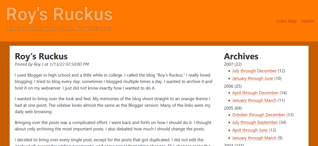
Because I’m a fool, I decided to switch Roy’s Ruckus to Pico CSS. Originally, I created the old site to look like my old blog. However, with the new features in Pico, I couldn’t resist updating the look. It’s still orange as fuck, but now it has a fresh look, and it is mobile friendly. The posts themselves were fine, but I overhauled the code for the rest of the site.

The sidebar took the biggest hit. Pico doesn’t have a natural way to support a two column layout. However, it is very flexible with custom grids in CSS. I was worried it wouldn’t work, but I was pleasantly surprised at how well it adapted. I couldn’t make the rotating chevron’s look good with Pico, so I ripped those out. I wish I could have kept the collapsible archives, but it turned out good enough.
Once I got it working with Pico, I decided to do some cleanup. I needed to add some paragraph tags to the posts. Also, I needed to format things to be more readable from a coding perspective. Nothing actually changed on the front end. I noticed that Blogger must’ve cleaned up some blogs that haven’t been updated in forever, so I had a lot of dead links that needed mopping up. The last thing I fixed was an issue where too many characters on a line would cause an overflow for the entire page. This mainly happened on mobile. I simply shortened the troublesome lines by removing characters or adding spaces.
I thought about separating each post into their own pages, but decided against it. I have a script that could be tweaked to easily do it, but there is a lot of additional work for it to look good. I would have to create excerpts, create individual pages listing ten excerpts apiece, create archive pages with excerpts, update the search JSON file, update links on Royfuss and Royfuss Games, and I would have to update some of my Royfuss Games scripts I use to search for blog posts relating to games. A few posts are too short to look good on a single page. I will most likely end up doing it someday, but not today. I think I got my annual web design bug out of my system for the year.
The next few weeks are going to be hectic for me; I’m a little worried I won’t have time to write a post for March. Hopefully I come up with something, but I might end up repurposing one of my old, unpublished writings. Maybe I’ll post a torrent of unleashed consciousness like the olden days. We’ll see, but I should have a beefy update in April.
Thanks for reading!
